
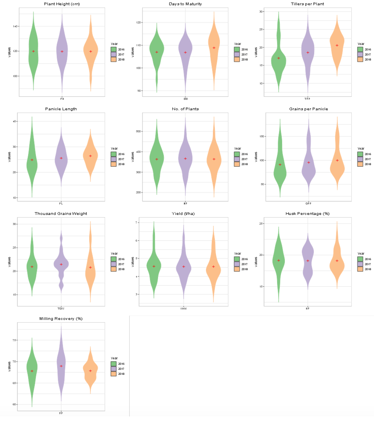
Figure 1 (a – j):
Violin plots depicting frequency distribution of all the genotypes / promising lines for studied traits during three years 2016, 2017 and 2018 represented with different colors in each plot.
Violin plots depicting frequency distribution of all the genotypes / promising lines for studied traits during three years 2016, 2017 and 2018 represented with different colors in each plot.