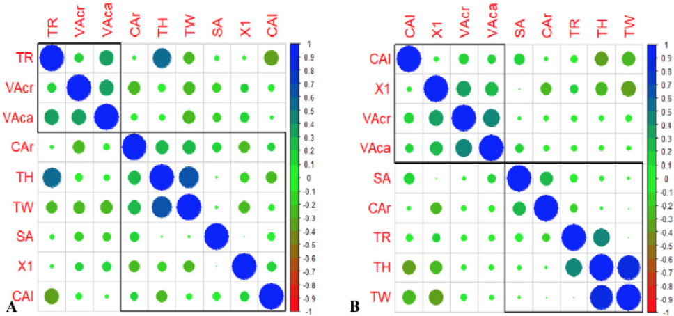
Fig. 3.
A, Correlation analysis matrix of PLFA with thoracic indexes in healthy group. B, Correlation analysis matrix of PLFA with thoracic indexes in unhealthy group. Correlation is represented by circles of different colors and sizes, in which blue indicates positive correlation, red indicates negative correlation and green indicates low or no correlation. The darker the color is, the larger the circle is indicating higher correlation. The correlation between the PLFA and the thoracic indexes showed low or no correlation in healthy group as well as the unhealthy group.